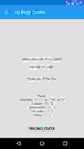
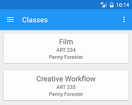
I did some basics for making the main page of my app a little more functional. It now has a message, if the lab is open or closed, which is automatically based on the schedule. In addition, the schedule is also now shown. I also have a spot for a message of the day, which can be for news, or if the lab closes early, etc., that is updated through the internet. Just need to do some better styling with it all, baby steps. Also worked on the classes section, it contains all the major classes for the photography program, teachers, and links to view their syllabuses and calendars, that expand on tapping.
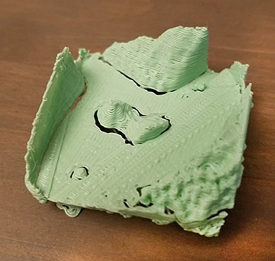
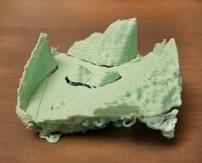
Now for the fun real work news. Prints! in glorious 3D! Or at least the one I managed to get done so far, all I can do right now are just little mini 'quick' prints. The quality isn't so great, and its pretty small, but as a test, I think it should be possible at least. :
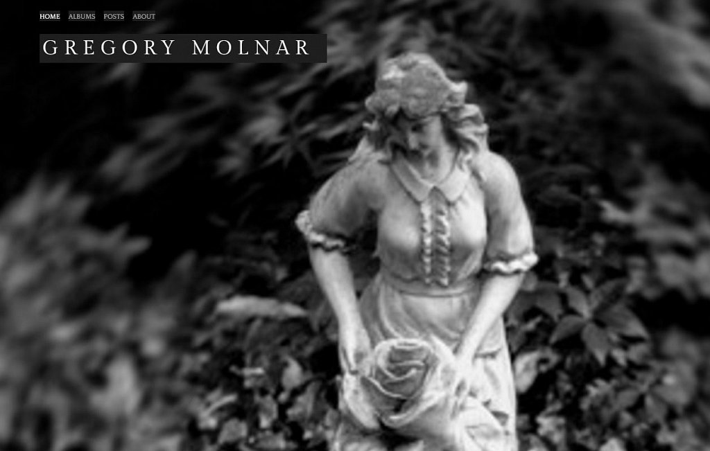
And the new main page for the website is mostly working, images are filling the entire page, and the header parts are there with some background to make it readable. Thoughts? The only thing then is you wont necessarily see the entire image, so I'll have to pick some where that isn't entirely important.
Some new inspiration:
Beili Liu:I don't know if this piece in particular is more about process, but I think its pretty neat anyway, along with her other work.
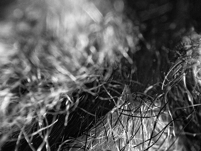
Finally the best for last(Maybe?) I've been working on some new images too, more little fragments, and also have been trying out some new editing methods. Here is the result for one of them:
So here's my long post about everything I've been working on, learning and whatnot as a catch up from being busy, among everything else I've been working through. To read everything, click the button ->
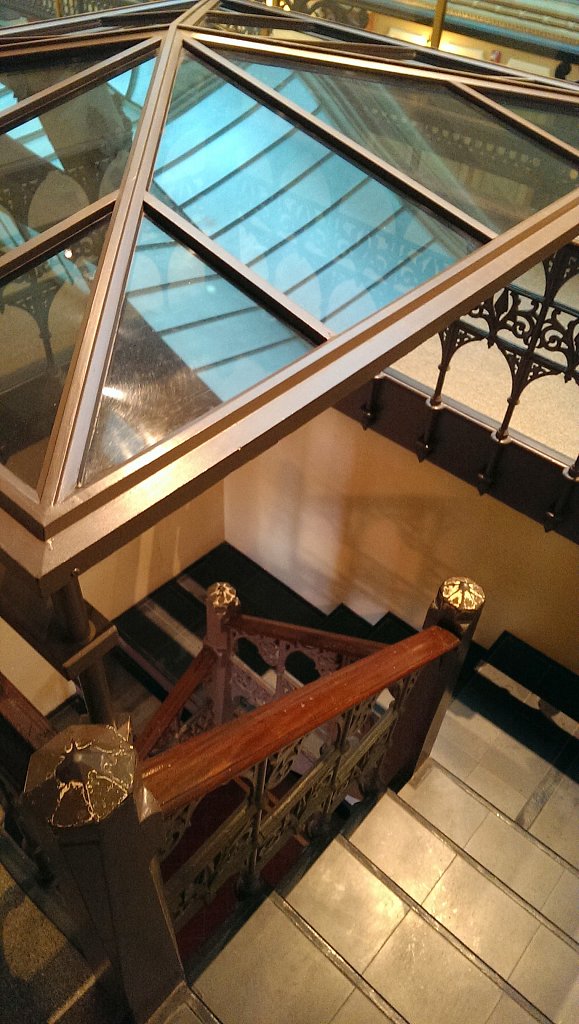
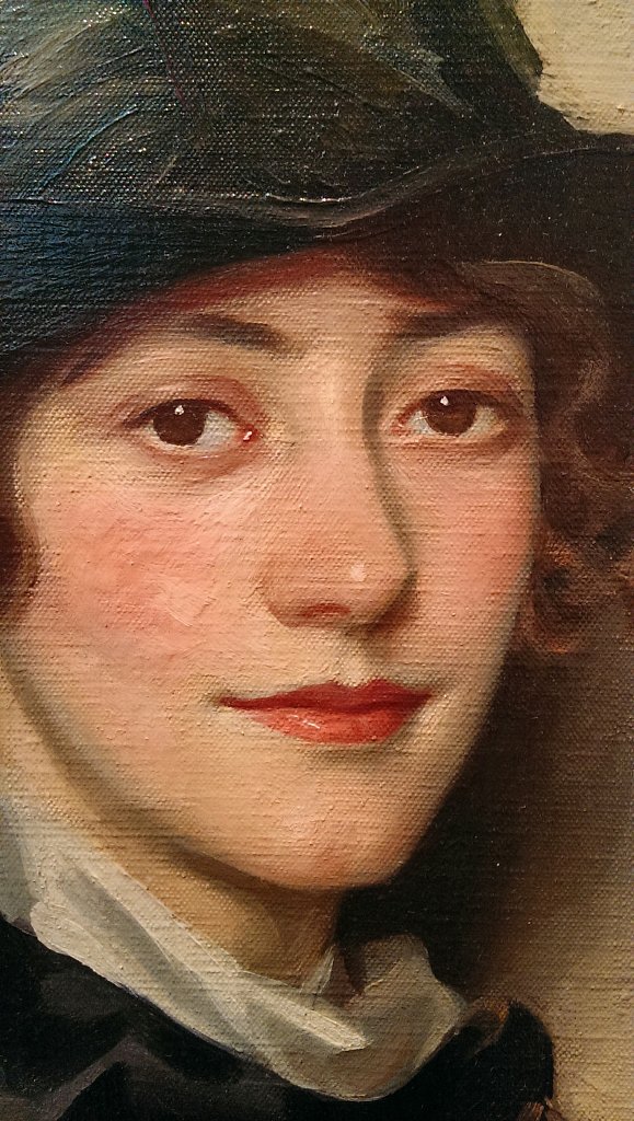
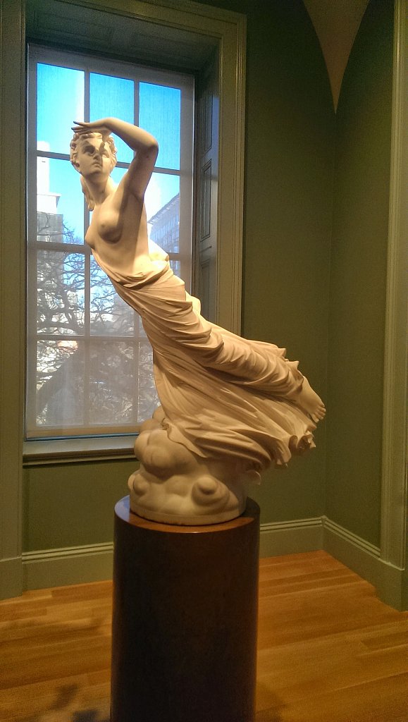
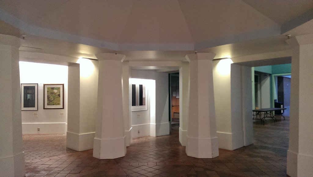
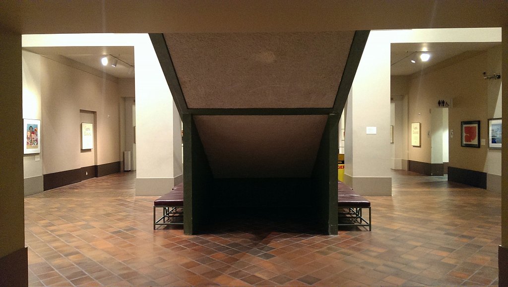
I went here not really expecting a whole lot since I'm not that big of a portrait person, but it was a little surprising with everything that was inside. I'm just going to try and post some favorites from my trip since there was so much here to actually see and try and get through, I didn't know that it was such a huge space. First was just the stairway, I thought it was just a fun space to be around on the inside of a building, it seemed out of place. What was great about the whole area is that you could pretty much be as close as you wanted to be for everything, to see construction, frames, brushstrokes, and so forth. They had some nice photographs there, but were hard to get good pictures of from the glass reflections. The Lynn Fontaine painting was one of my favorites here, there was another done of Juliette Gordon Low that I also liked done in a similar style.
Stairway for the 5th floor
Lynn Fontaine closeup
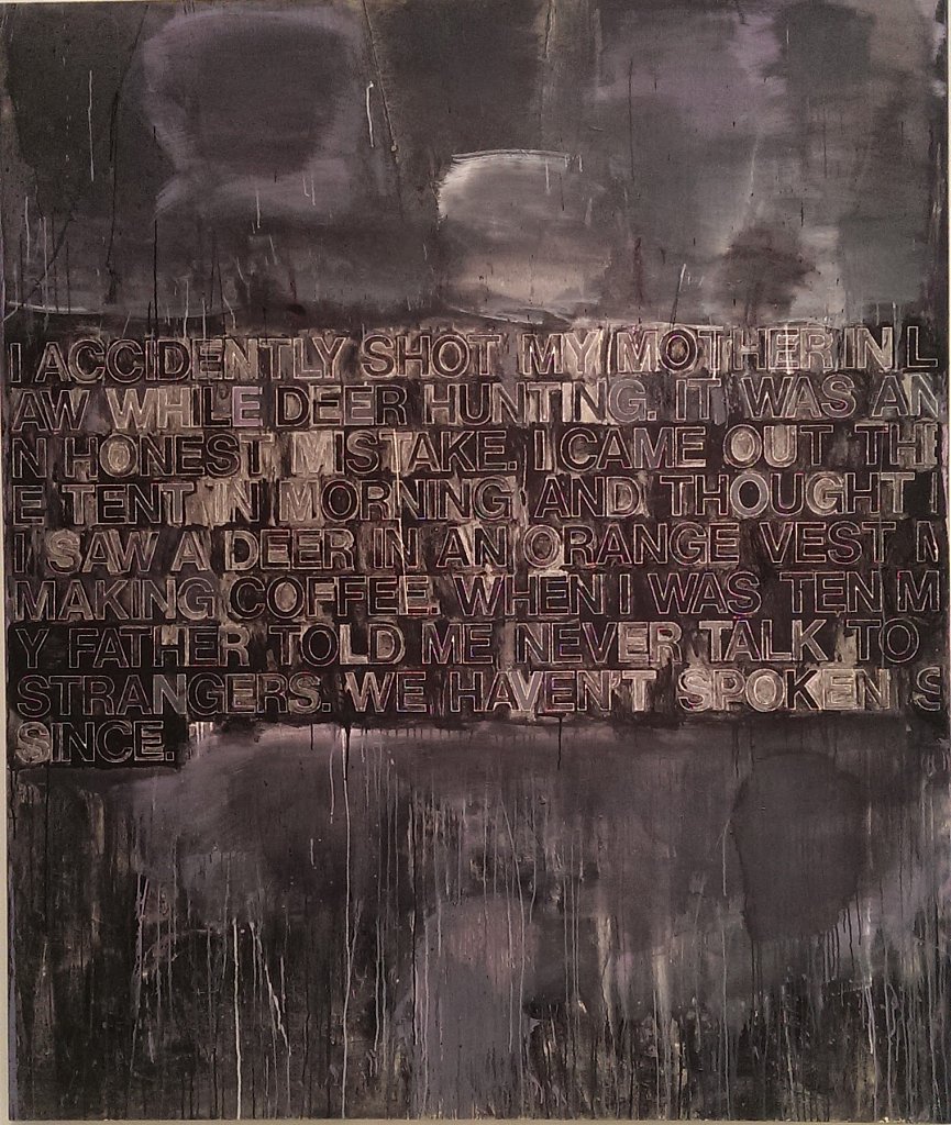
Richard Prince - In Morning
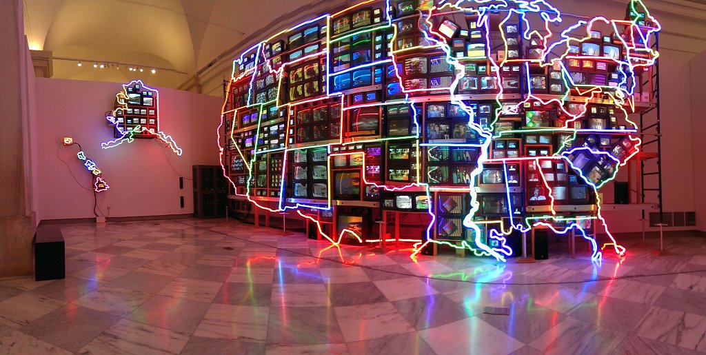
I then stumbled into a more modern art section that I didn't know about being there. This piece by Lowe I thought was pretty funny. They piece by Paik was more interesting to see in person than the books because of all different sounds from the televisions. It did make it a little hard to kind of zone into one area to follow them through a cycle, but I suppose that's part of the point of the piece too.
nam june paik
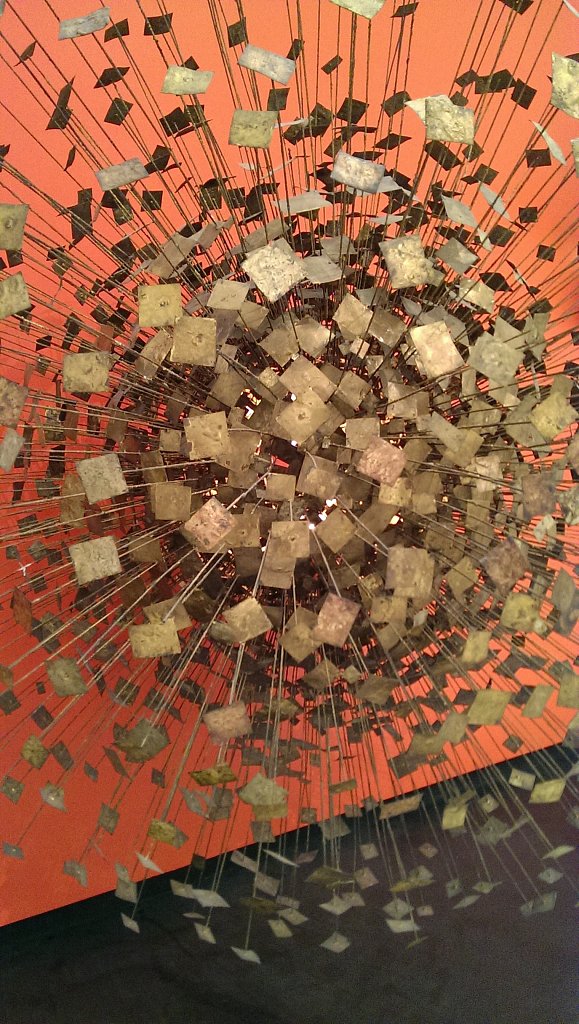
Harry Bertoia
Some of the sculptures were really interesting like this one, but others that were pretty much a modern art painting extruded into 3-D weren't as impressive to me. I like how it's reminds me of a frozen explosion in time, and being able to see the light coming out from the middle emphasizes it.
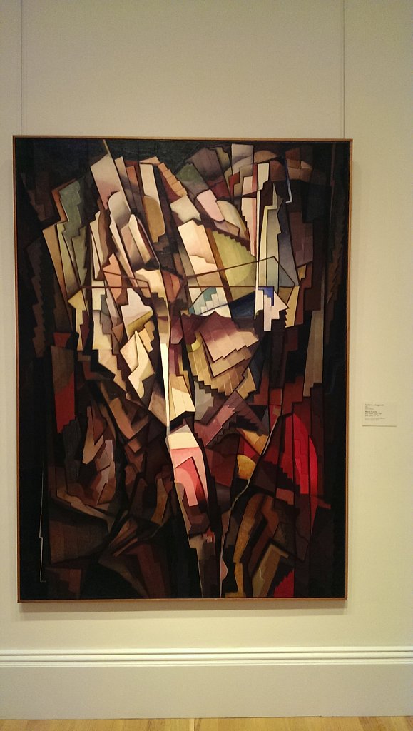
Morris Kantor
This last sculpture looked really familiar in comparison to one I saw at the Philadelphia Museum of Art, but a little different from the space it was in and the scale. Overall there was a lot to go through and I'm sure I missed a bunch of things too, but it was a fun and exhausting trip.
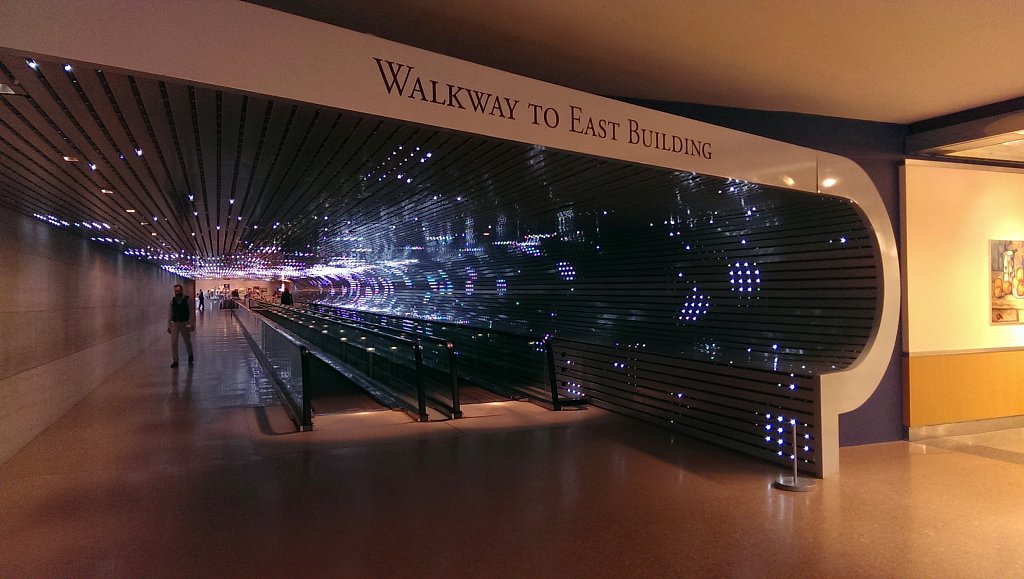
I went back to here to find an installation by Leo Villareal which took a little effort, but I really liked it for the most part. It goes under to connect each wing of the gallery, and has a moving sidewalk to go across too, but it was pretty shaky. The lights move around in random patterns, and sometimes go off all the way making it pretty dark inside. I just wished that it continued along the other side of the wall and completely encased the hallway. Another thing that would maybe add is to have the light patterns interact with people as they move through the space, instead of being their own entity.
They had a lot of other nice pieces of art too, but I didn't get to see as much here. I only got to run through quick since it was getting close to closing.
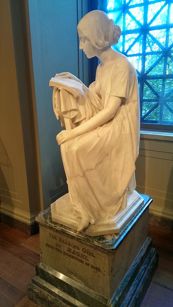
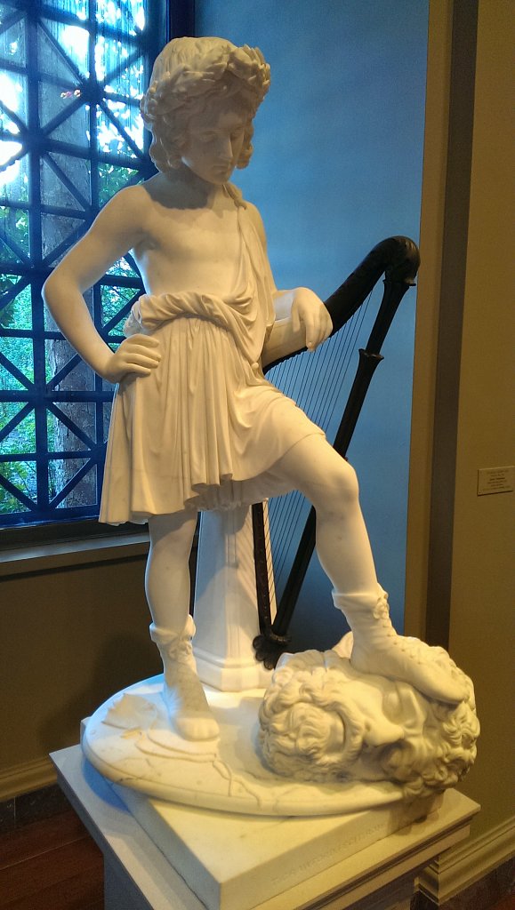
I always like looking at the marble sculptures, it's still amazing to me how people could create such smooth, detailed forms out of stone, and I like how they just have plain finishes to emphasize it.
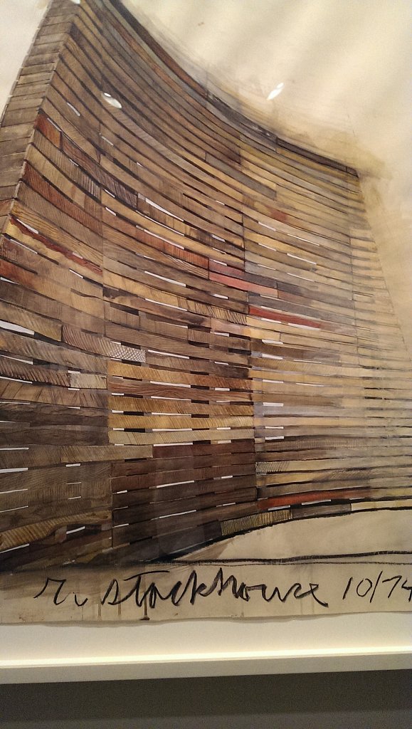
Robert Stackhouse - Drawing for Ghost Dance
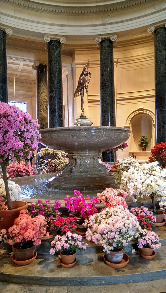
All the entrances and shops were covered with flowers for the festival that was about to start. I also got to see some of the more abstract paintings from Pollack and some more of the color field paintings here too. One of the big sections was closed off for a show that was being installed at the time, so sometime I'll have to get back to look around more.
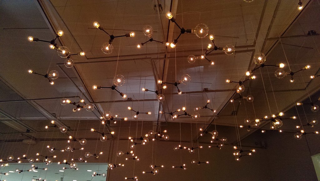
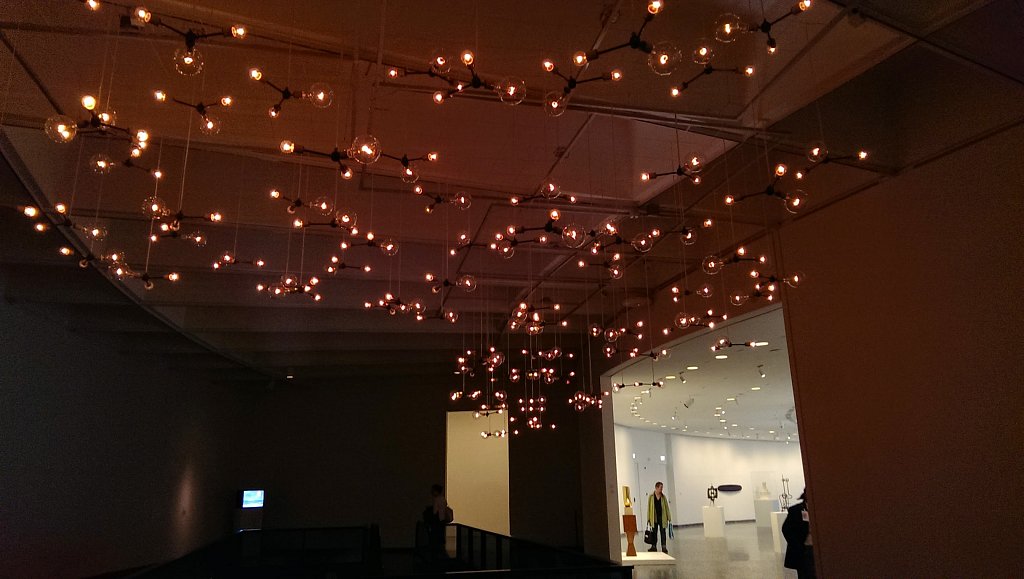
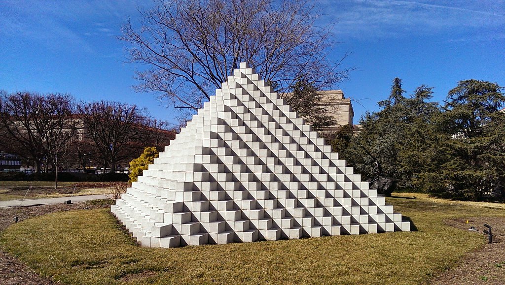
I went back here to see some of the installations and get some pictures that I missed the first time around, and was happily surprised on this visit, it went a lot better. There was a whole show going on when I went, and it had a lot more interesting things than just the boring sculptures I saw before that were still there. The one i saw before that I liked was by Spencer Finch, called Cloud. I like the use of the dim lightbulbs and how they are spaced apart. The repetition of each strand, and how its pretty simple it how its hanging is nice to hide the underlying structure, and gives the illusion of it just hovering in the air.
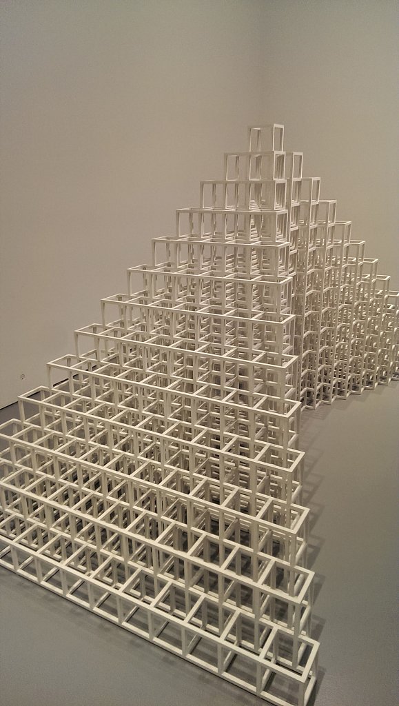
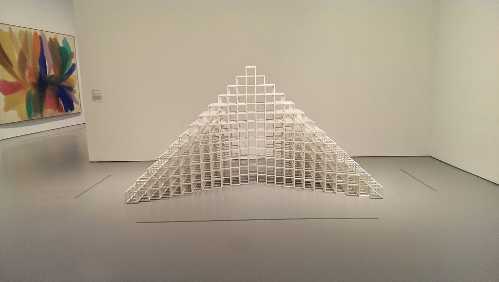
A new sculpture I saw this time was by Sol DeWitt, called 13/11. I liked being able to walk around it and see all the different shapes and ways the lines would converge.
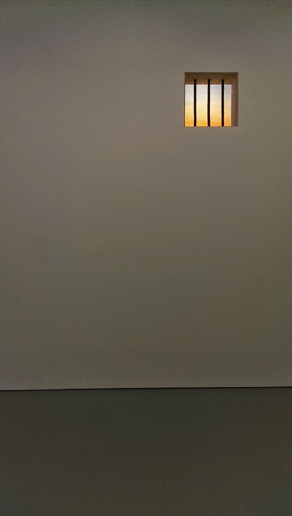
This one is by Robert Gober, and is Untitled. The window area itself is really high up on the wall, and is so simple looking, but it has interest because I wanted to be able to see what was going on through the other side, which is impossible.
They also had a large section of video displays and other installations that I couldnt take pictures of but were really neat. One was a whole room sized piece that had a bunch of tables with different objects on turntables. They each had lamps behind them, and cast moving shadows onto the wall, and it also had a music and sounds going along with it. Other areas had huge wraparound displays that you could stand inside of and be surrounded by. One put you into a walkthrough style animation, others were more like moving portraits.
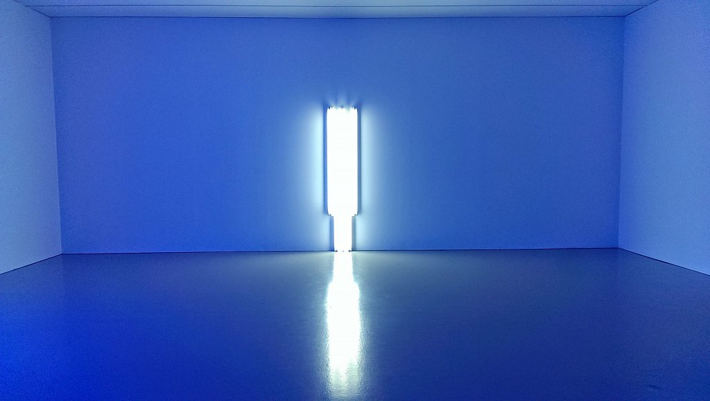
They also had these light installations by Dan Flavin. The pictures came out pretty bad from my phone from the all the florescent tubes and lights but it was pretty fun to be in the space and walk around in, especially after talking more about it with my professor. It's such a simple use of space, light, and color, but has a pretty commanding presence when being there.
Outside nearby is a sculpture garden, but it was closing pretty much when I got there, so I just took one quick picture of this by the gates. I liked how the sunlight played with the geometric patterns and cubes.
This was a fun little gallery in Washington D.C. next to the Smithsonian Castle that I went to, initially trying to find some installations to look at for some inspiration. A lot of the people there talked to me too, and explained a bunch of what the different artworks were about which was nice compared to some of the others.
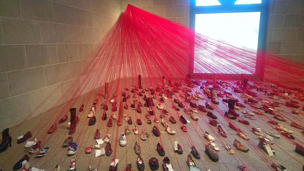
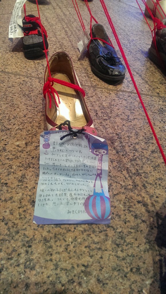
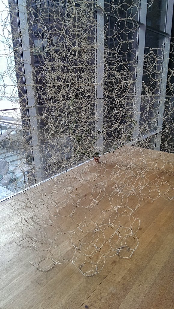
This is the first one I saw, and is right inside the entrance. It consists of different types of shoes that women wore, and they all had written notes attached to them, and all were attached together with the red string. I liked being able to walk around it and see how the lines move around to make shape, and all the different types of shoes too.
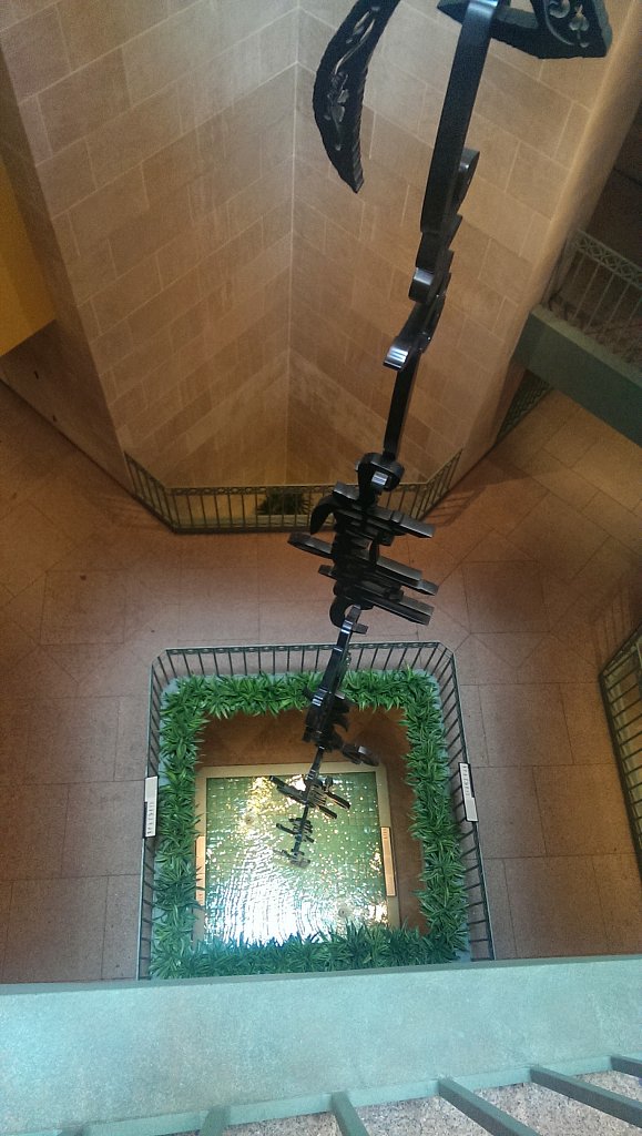
This is of a piece called Monkeys Grasp for the Moon, which uses the word monkey in different languages to create a huge vertical sculpture over a fountain. It was interesting because I haven't seen a sculpture done totally vertical in a space like this before, and you could walk all the way around it on all the different floors of the gallery to get different views.
One thing I liked about the gallery itself is that there were some fun spaces to just be in and walk around. The floor plan itself was pretty simple and you couldn't really get lost or turned around in, which made it easy to see everything and have a direction to go. I think some of the paintings around this area were a little boring and generic maybe, but I probably don't know enough about them to say. There wasn't really anyone around this area to ask and they didn't have much information posted anywhere.
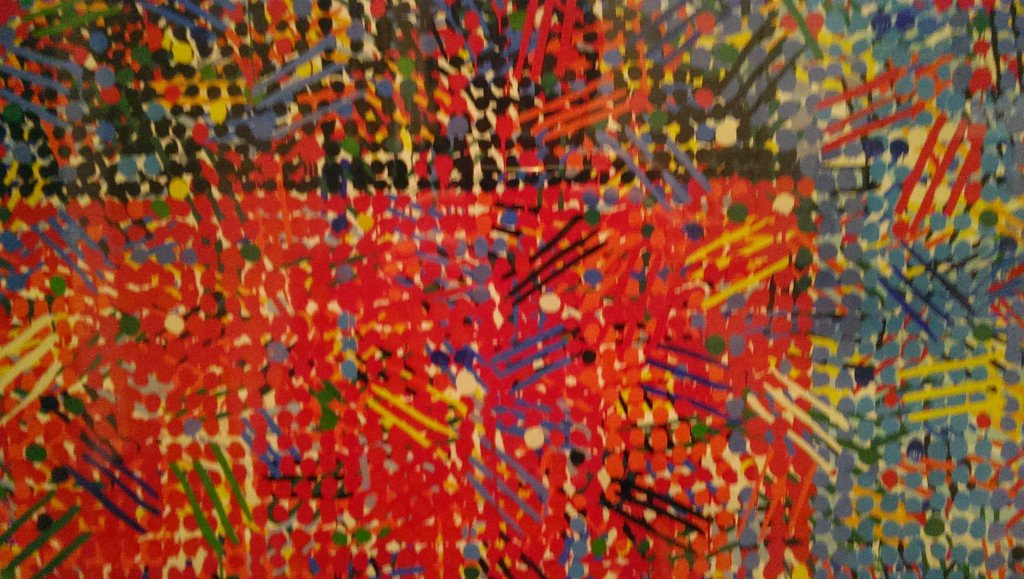
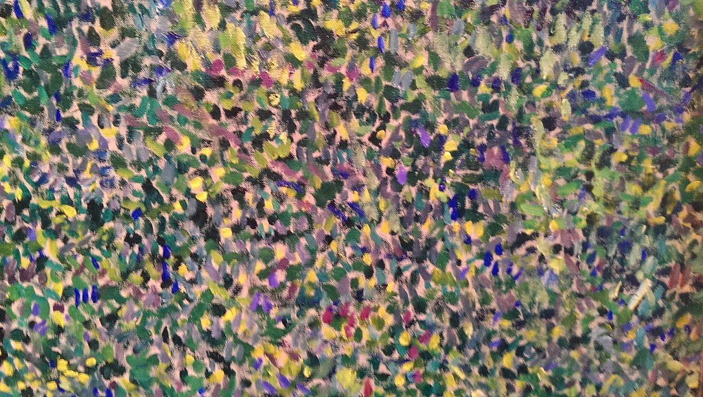
This is one of the paintings I liked, sort of in an impressionist style, I like how it looks different depending on how close you are to it, and goes all the way to being just lines, dots, and color, like a screen nowadays.
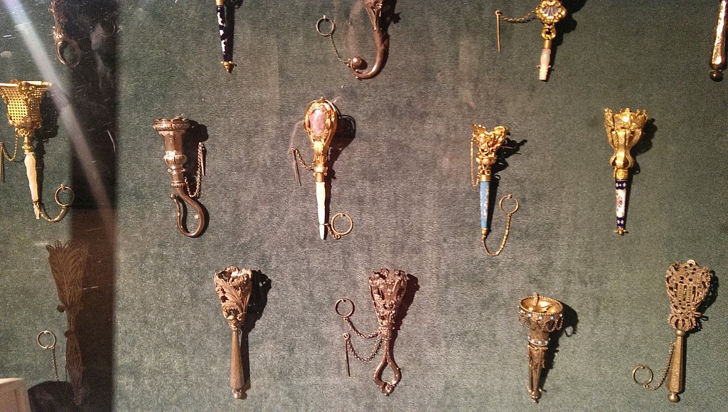
These were the last thing I saw before leaving, they had two cases full of them. I think they were used for holding certain types of flowers in, and were quite detailed for being so small and handmade.They were just hard to see since there wasn't much light on anything in this area of the gallery.
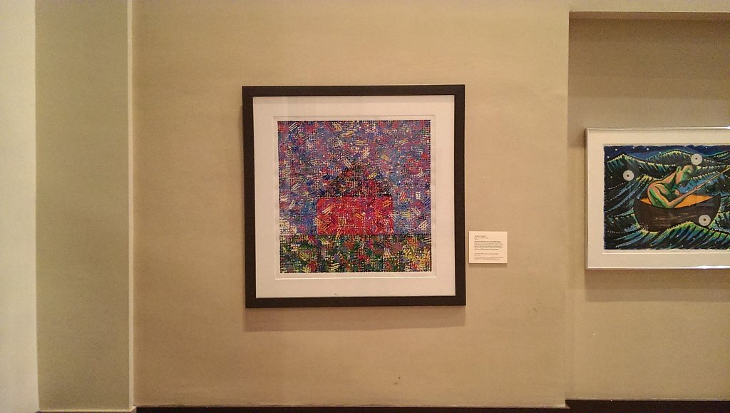
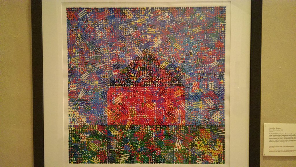
While in New York I did get to stop at the Museum of Modern Art for a quick stop. It was really crowded and probably the busiest gallery I've been to. There was a good variety of different artists, pieces and styles. There was a huge section of photography as well. This first abstract piece I saw I liked the colors and patterns it had. Usually I'm not really into modern art, but I've been trying to understand more of it this past semester and it's been helpful with my own ideas.
Paul Klee
They also had a bunch of work that was more famous and recognizable compared to other galleries, a lot of Van Gogh, Picasso, and Mondrian, among others.
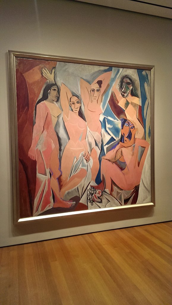
Picasso - les demoiselles d'avignon
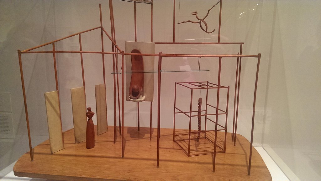
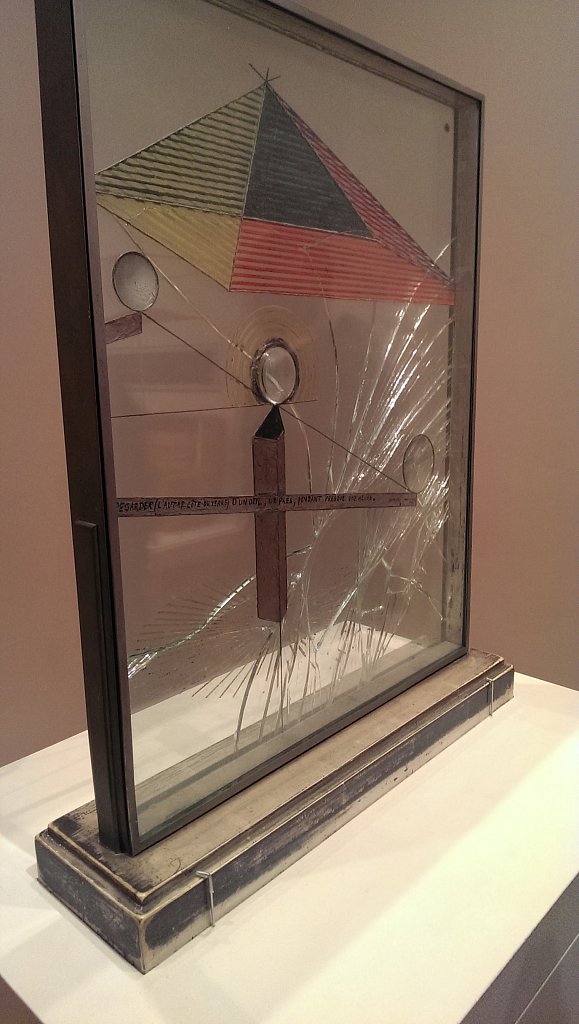
Duchamp
This piece by Marcel Duchamp is one of the sculptures I went to look at. I've always liked reading about him in my classes, and this one I didn't see before. It's so tiny compared to the one at the NGA, but I still like the use of glass and seeing things through the distortions and cracks. They didn't have any paperwork or anything to explain more about it though like the other gallery had.
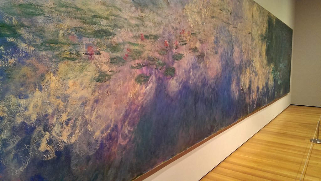
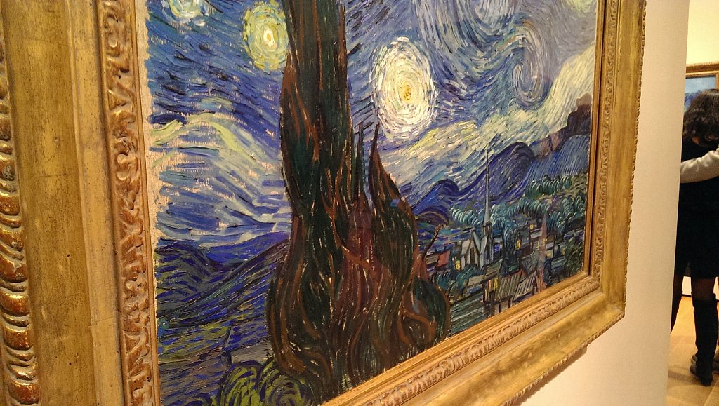
This is one of Monet's waterlily paintings, which I never knew was so large in scale. The room itself had three large paintings, one on each wall, all taking up pretty much the entire length of each wall.That's one of the things I enjoy about going to visit galleries, being able to see things as they actually are, instead of from a book or on the computer screens. A lot of the other paintings had a lot of fun, simple colors, and others, like the impressionists were all over the place to create their pieces. It was nice to be able to see them up close, like Van Gogh's Starry Night. It probably had one of the bigger crowds around it at this museum, and was hard to get close to. One thing that didn't make sense is that everyone there just seemed to stand back and look at it, but hardly anyone went up close to see all the little details that make it even more interesting.
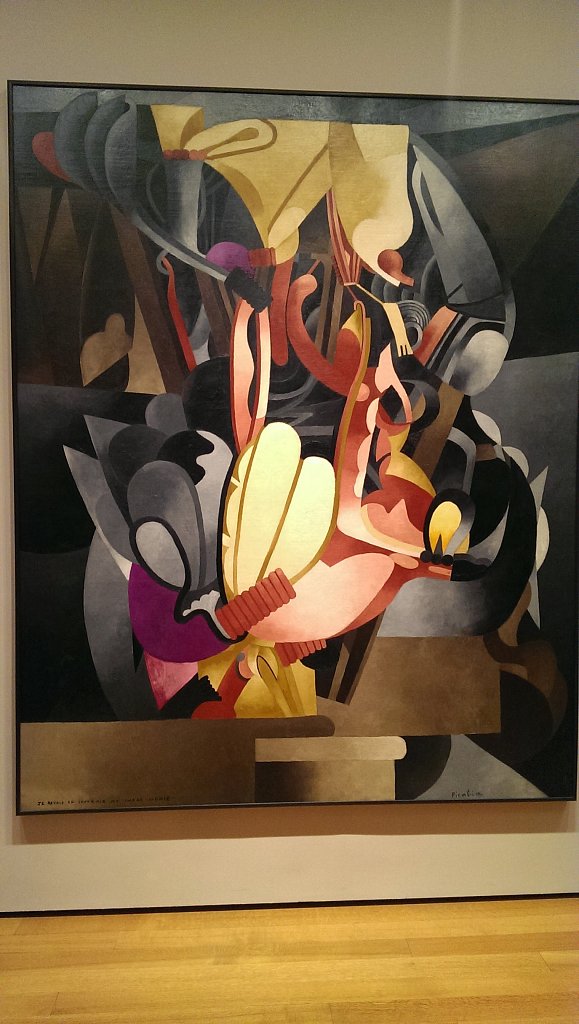
Francis Picabia
Gustav Klimt - closeup
Van Gogh - Starry Night
This last sculpture was hard to see from its location and color, but it was neat to be able to see the simplicity of its construction and use of space.
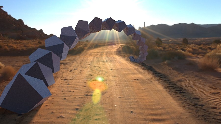
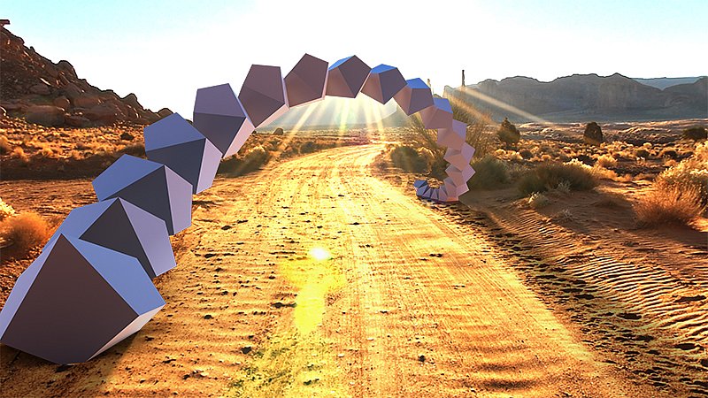
For this background image, I thought that an archway type set of shapes would be the first thing to try. It took a bit to figure out how to create them easily without having to manipulate each shape separately, and into a position where they are more connected than spaced apart from each other, but I think it works for now. Then it took even longer to figure out how to make the quality of it a lot higher so it would look better for printing. The initial hdr image that I was using had a lot of the lighting information, but it was blurred out a bit for smoothing When I switched to a higher resolution image that it came with, it lost the better lighting information, along with the shadows. So the end result was to blend each layer together a bit, so everything would come out.
I also did another metal print using the clear coating this time instead of the white, since we changed the printer back to glossy ink for it. It came out pretty good I think besides the part where it gouged into the sheet, but I figured out the issue and I'll just have to recoat a new piece and print it out again.
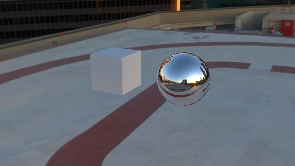
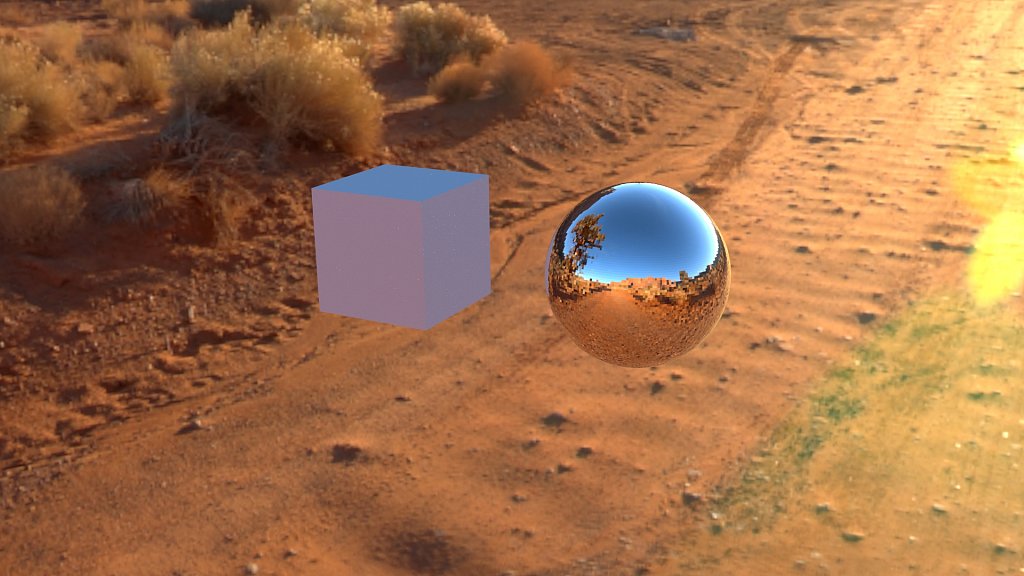
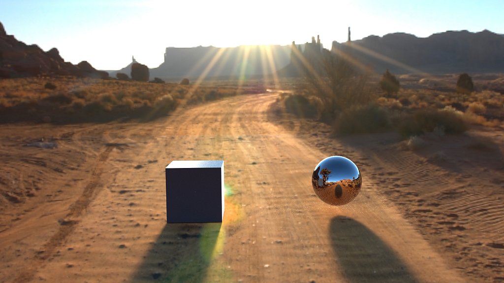
After my last meeting, my project has changed a bit, but moreso just on scale. So now instead of only thinking my photo shapes have to be small, or clung together, they can be models for something much, much larger. Going off of that, and off the different artists and architects I've been looking at, I'm making digital visualizations of my shapes being in an environment as a large structure. I've been reading and learning about everything that goes into that with the tools that I have, and have made a few simple tests so far. My first set of them are below, the environments I'm using are from online, I saw how to create them, but I'm not sure if i have the time to do all of that, or to get it working in time, so I do have some options. The last test I did I got it to look more grounded by setting up the shadows, and moving the camera around a bit.


